Executive Summary
Problem
A powerful product vision trapped in an unusable application, blocking user traction and the ability to attract investors.
My Role
As a UX expert and a member of the LoL community, I proactively intervened to lead a complete strategic product review, from vision to design execution.
Solution
I proposed a pivot to a 'low-poly' visual style to maximize accessibility and created a focused user flow that prioritized the first-time user experience.
Validated Impact
My work transformed the product into a demonstrable and investable MVP, which directly contributed to the company securing its first seed funding round of 250,000 Euros.
1. The Situation: A Valuable Asset Trapped in a Liability
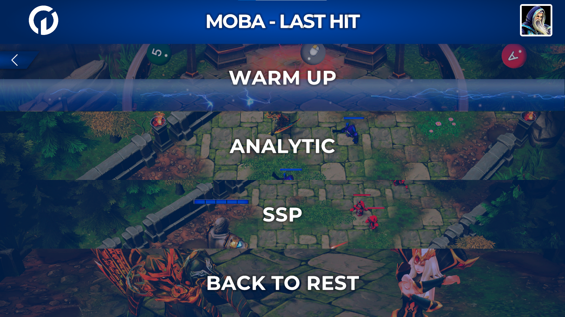
United Gamers had a solid foundation: a sports science-based training method for gamers. However, their initial product was an anchor sinking the business:
- Technical Barrier: The application was heavier and more demanding than League of Legends itself, excluding most of its target market.
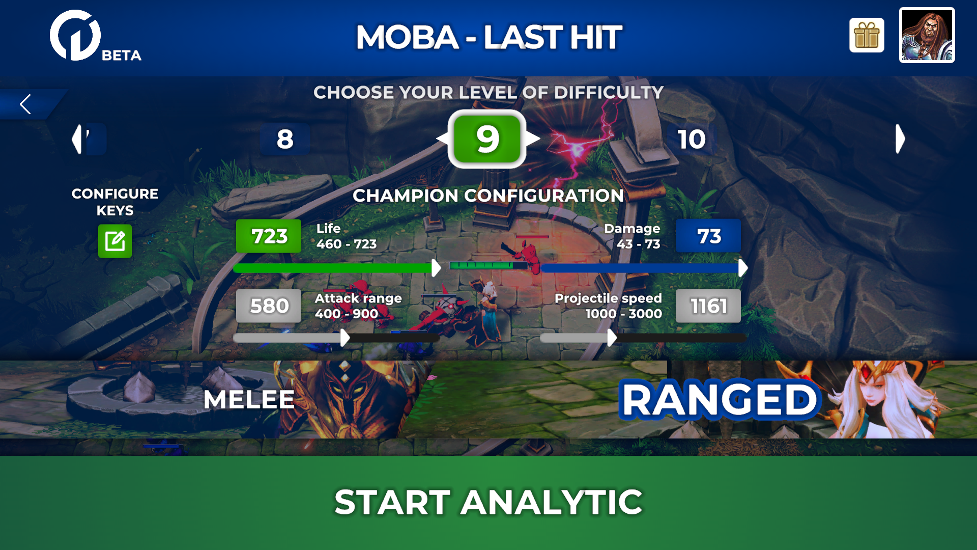
- Activation Failure: The UX was so confusing that new users failed to start a single training session, resulting in zero retention.
- “Un-demonstrable” Product: The experience did not communicate value, making it impossible to present a convincing case to investors to raise the necessary capital for survival.
The company was at a standstill: it couldn’t get users without a better product, and it couldn’t afford a better product without funding. Here is a sample:
2. My Task: Forging an Investable MVP
Leveraging my 8+ years of experience in the LoL community, I approached the founders with a direct diagnosis and a clear mission. My mandate was not a simple redesign, but a foundational transformation:
- Diagnose the critical product and UX failures.
- Define a new strategic vision for the product that was both achievable and desirable.
- Design a focused MVP, eliminating everything superfluous and perfecting the most critical user flow (the “Golden Path”).
The ultimate goal: to transform the application into the company’s main fundraising asset.
3. The Action: Strategy First, Pixels Later
My approach was a sequence of strategic decisions that laid the groundwork for the design’s success.
Part A: The Strategic Vision - The “Low-Poly” Epiphany
My most critical discovery was that trying to mimic LoL’s graphics was a mistake. I proposed a radical pivot:
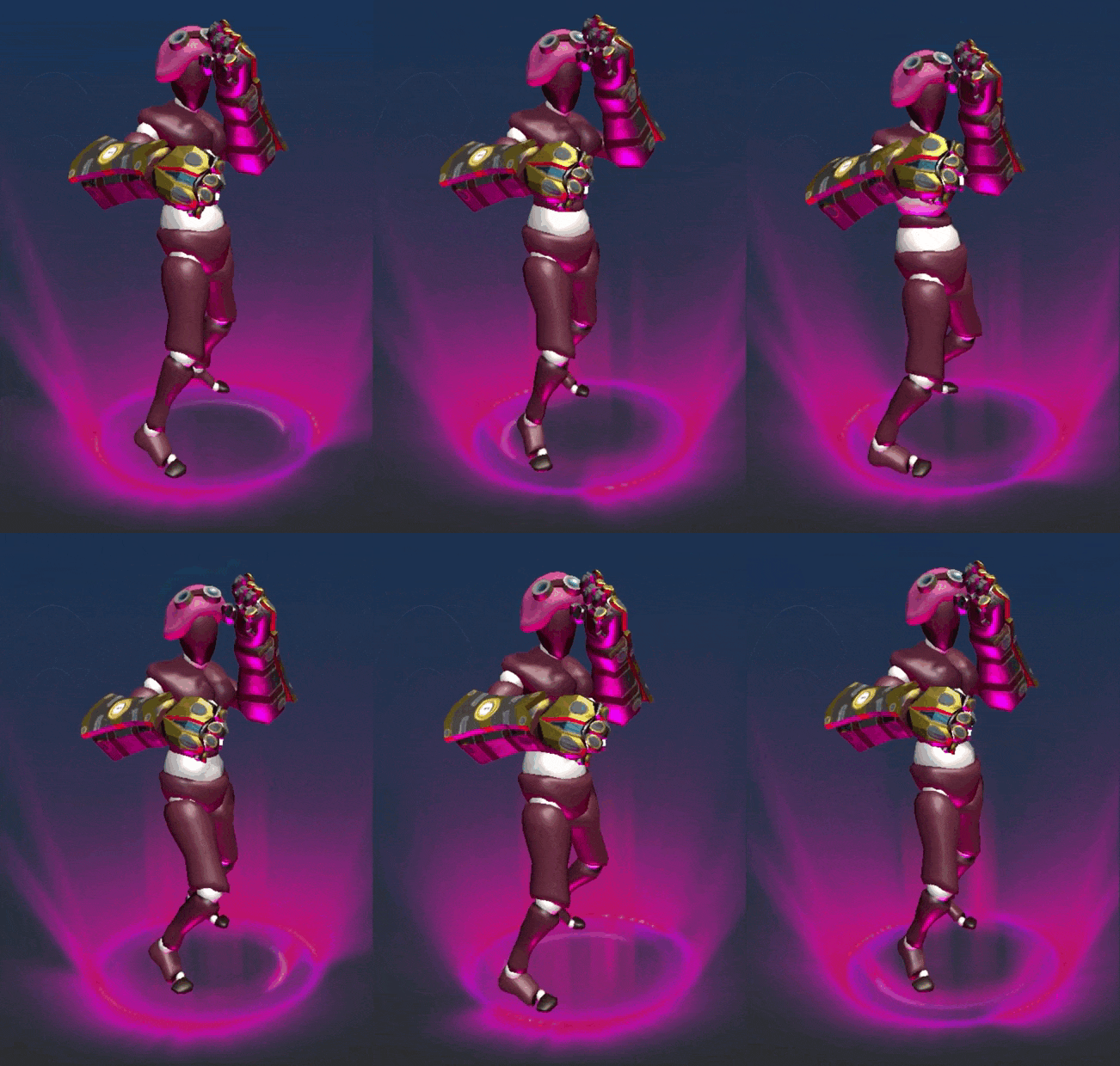
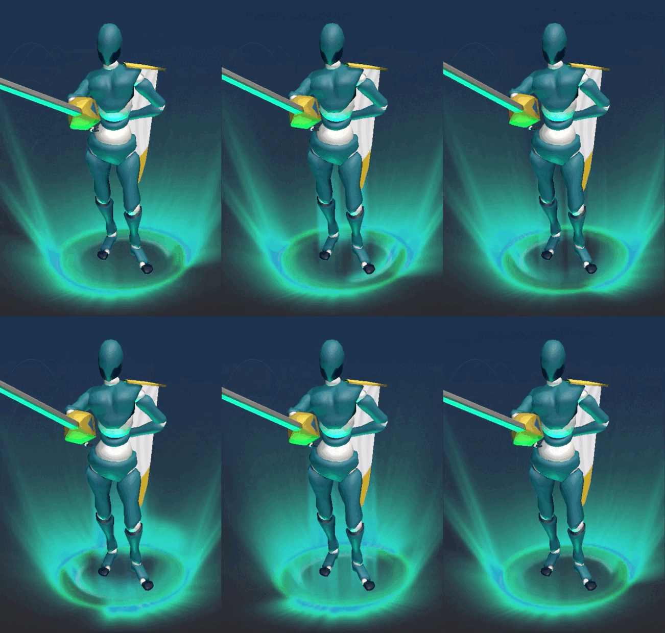
Adopt a deliberate “low-poly” visual style, focused on iconic silhouettes.
This product decision, not just a design one, solved multiple problems at once:
- Performance and Accessibility: It made the app instantly accessible to any LoL player, regardless of their PC.
- Unique Visual Identity: It created a memorable aesthetic and avoided looking like a “cheap copy.”
- Focus on Gameplay: It allowed the team to focus on what mattered: the training experience.

Part B: Design Execution - The Path to the “First Win”
With the strategic vision established, I designed a user experience that supported it, centered on three themes:
1. Eliminating Onboarding Friction: I redesigned the initial flow to take the user from registration to the game in under 60 seconds. All unnecessary steps were eliminated, focusing on a linear wizard that culminated in the “Start Training” button.
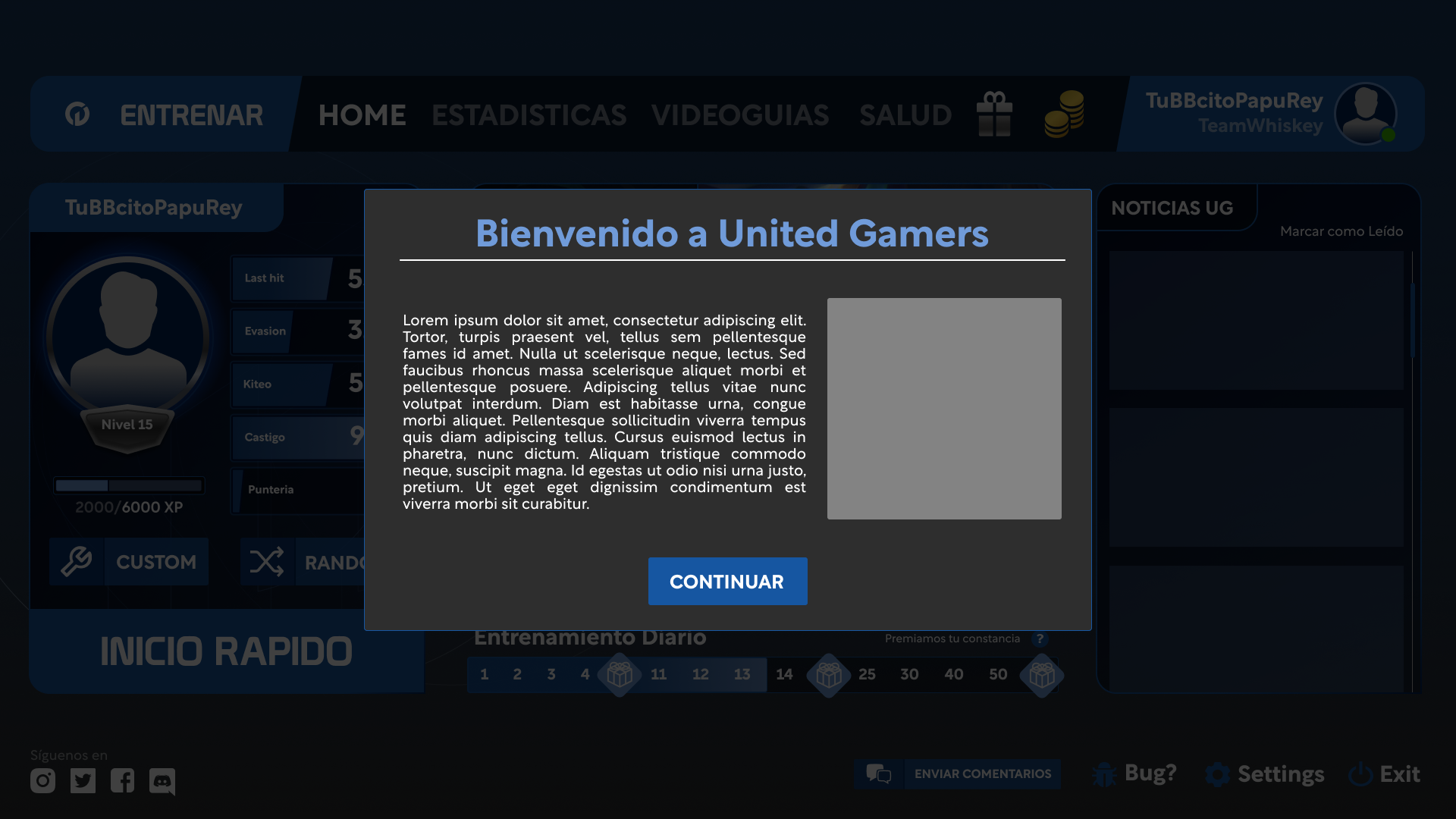
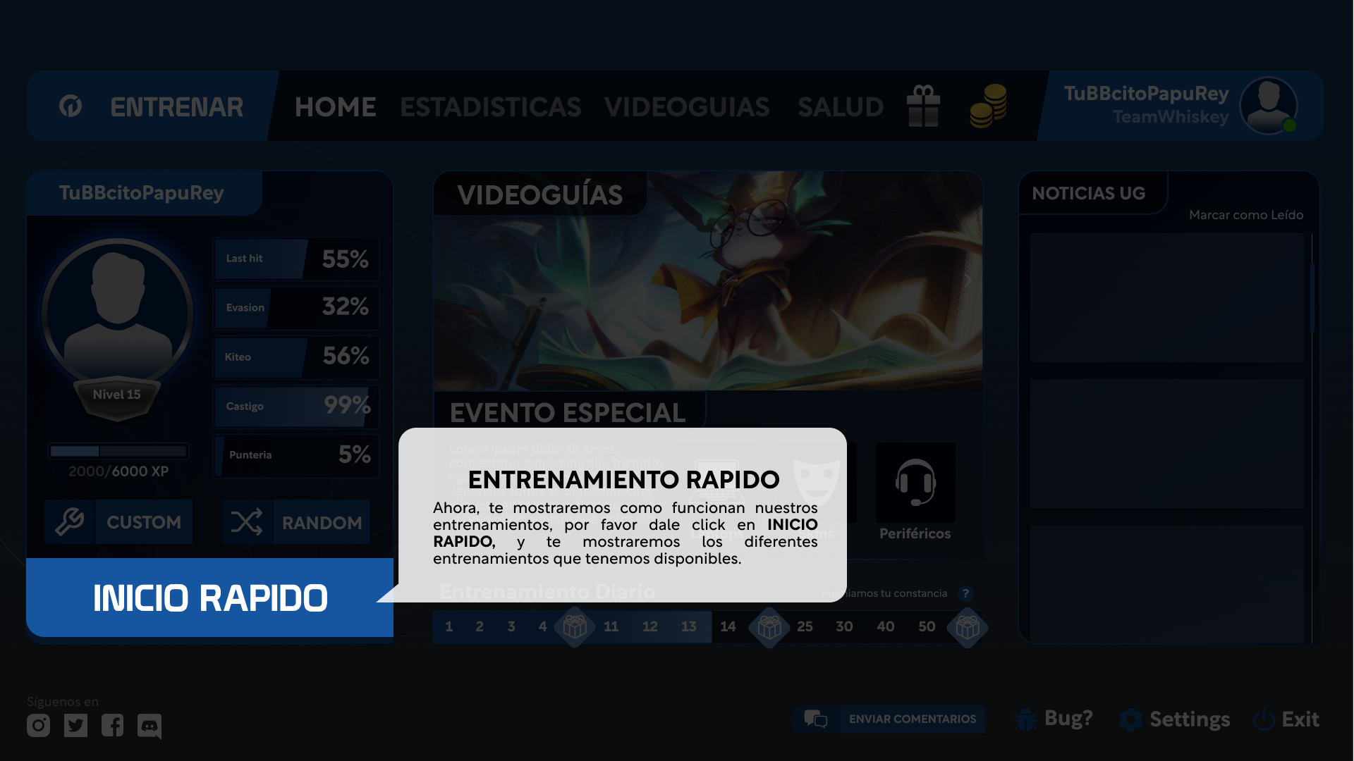
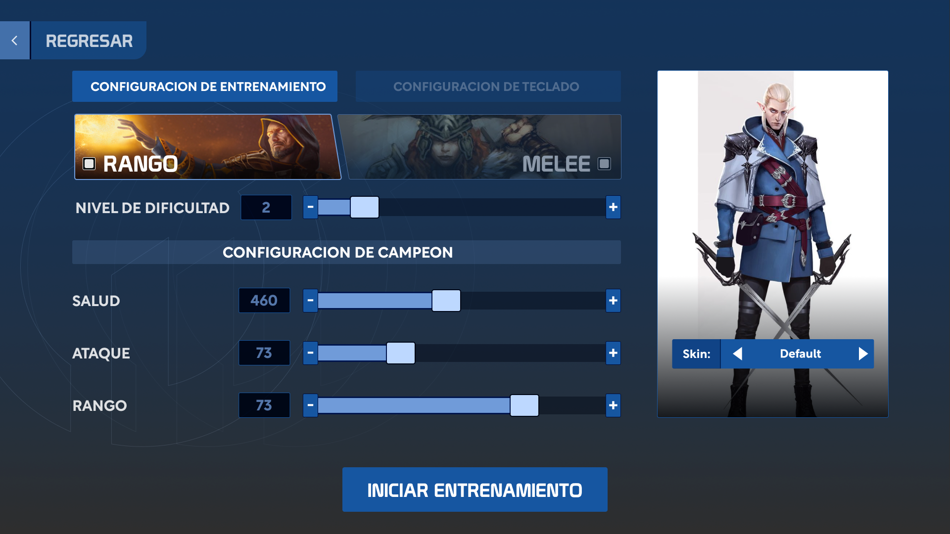
2. Creating a “Hub” for Progress: The new main dashboard was designed to answer two questions: “How am I doing?” and “What do I do next?”.
- A hexagonal chart provided an instant overview of strengths and weaknesses.
- A prominent “Quick Start” button launched a pre-configured session, reinforcing the daily habit.
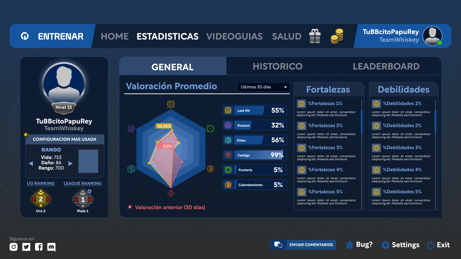
3. Building a Growth Engine: For a startup with no marketing budget, organic growth was vital. I implemented two key features from the start:
- A “Recruit a Friend” system to encourage word-of-mouth.
- An omnipresent feedback button to turn early users into an extended QA team and ensure we never navigated blindly again.
4. The Result: The 250,000 Euros Check
Although my consultancy ended before I could measure long-term retention metrics, the impact of my work was validated in the most compelling way possible for an early-stage startup:
The redesigned product, with its new strategic vision and polished user experience, was the centerpiece that allowed United Gamers to present a convincing case to investors, successfully securing a 250,000 Euros seed funding round.
This capital not only validated the new product direction but also ensured the company’s survival and future growth.
5. Key Learnings
- The best UX is sometimes a technical decision. My biggest impact on the user experience wasn’t a wireframe, but the strategic recommendation to switch to “low-poly,” which made the product accessible and enjoyable for everyone.
- In startups, design must serve the investment narrative. My job was not just to improve usability, but to build a tangible and demonstrable product story that inspired confidence in investors.
Fun Fact
This project was around 2022, and currently UnitedGamers changed its name to SkillGap and they have made changes to their UI, however much of the information architecture remains.